Airstream Life Website
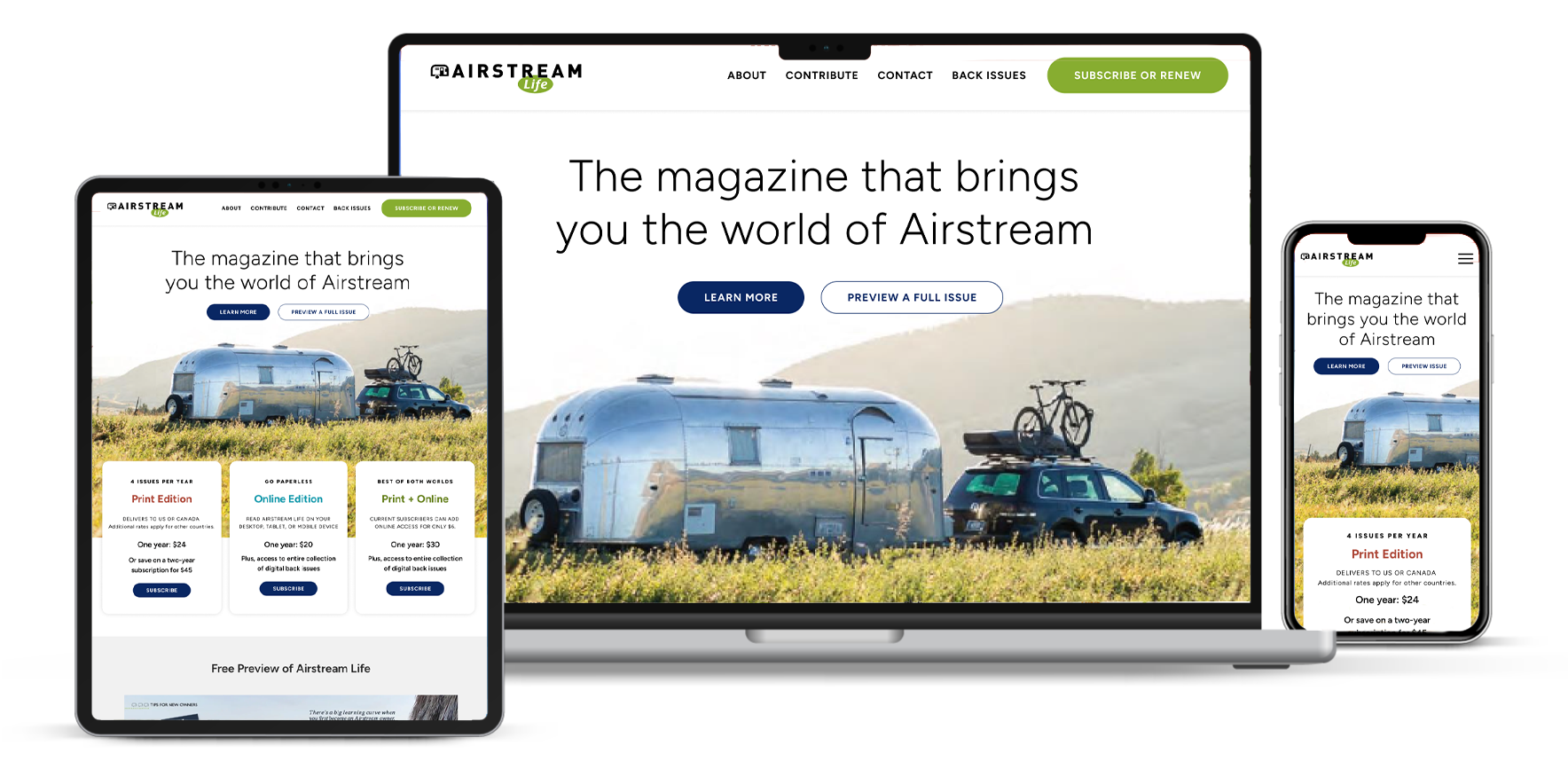
Airstream Life needed a site that matched its open‑road spirit. I rebuilt it with an image‑first design and a streamlined subscription funnel — making the brand feel editorial and the buying path obvious. The result: clearer storytelling, easier discovery, and measurable lift in conversions.
Challenge
Airstream Life’s legacy site felt heavy and disjointed. Dark backgrounds buried photography. CTAs blended into low‑contrast areas. Subscription options were hidden in a dense mid‑page block — making signups slow and frustrating.
Solution
Clean, image‑first layout with generous white space so photos pop.
Crisp, readable typography for all devices.
Subscription options moved above the fold into a clear three‑column pricing card with distinct benefits and high‑contrast CTAs.
Homepage reordered to tell a cohesive story: immersive hero → clear value props → inline free preview.
Simplified nav with standout action button. Streamlined footer for trust and easy access to secondary links.
Results
A lighter, editorial site that highlights the brand and boosts conversions. Photography and storytelling lead; subscriptions are clearer and easier. The site now feels like the magazine — and performs like a conversion engine.