Bird Watcher’s Digest Website
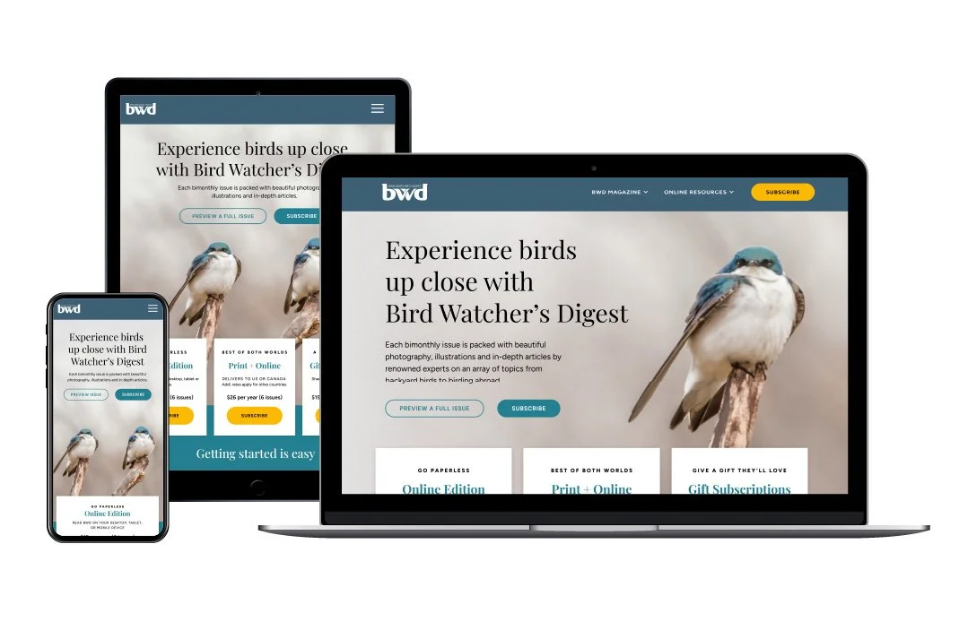
Bird Watcher’s Digest was evolving into BWD Magazine and needed a digital home to match. I redesigned the site into a modern, editorial experience with a focused subscription journey — making the brand feel premium yet welcoming — then developed it in WordPress.


Challenge
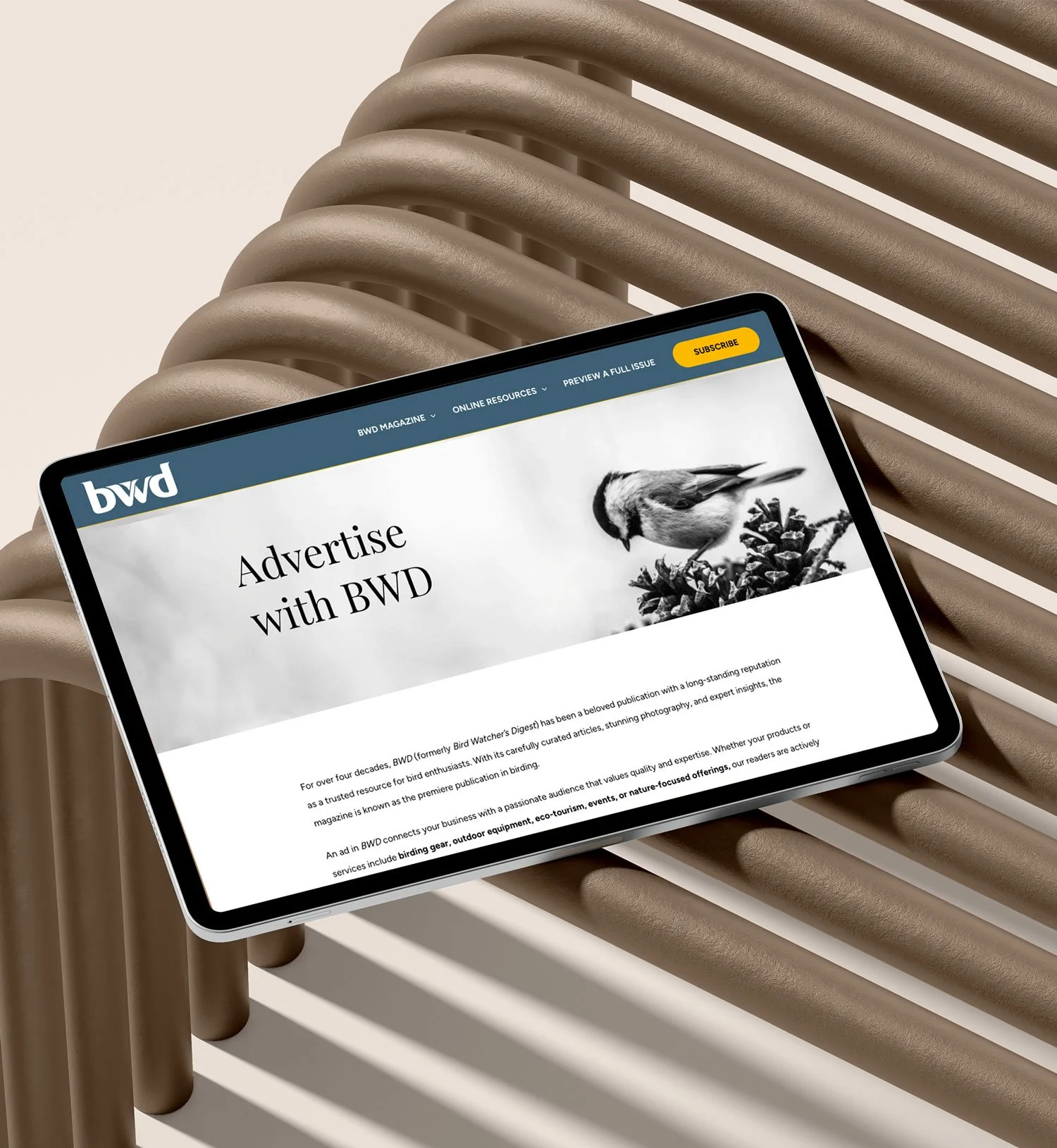
Bird Watcher’s Digest’s legacy site felt dated and cluttered. A busy hero, stacked color blocks, and generic blog cards buried the magazine’s personality. The primary “Subscribe” CTA competed with multiple messages, and content was hard to scan — making it unclear why (and how) to subscribe.
Solution
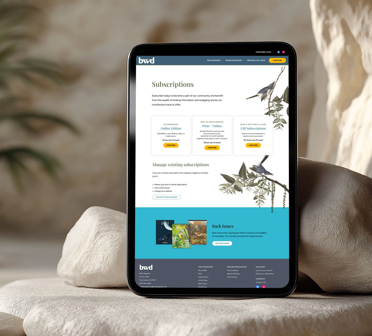
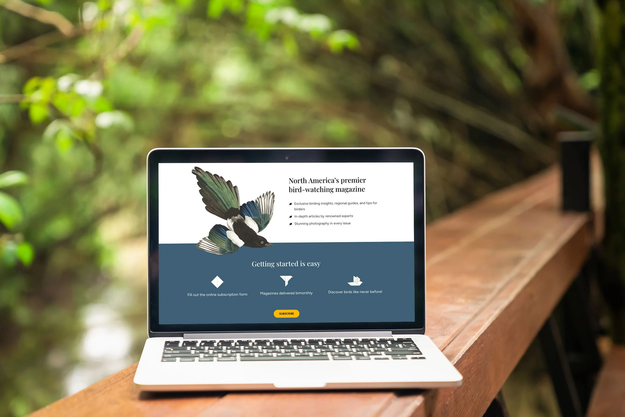
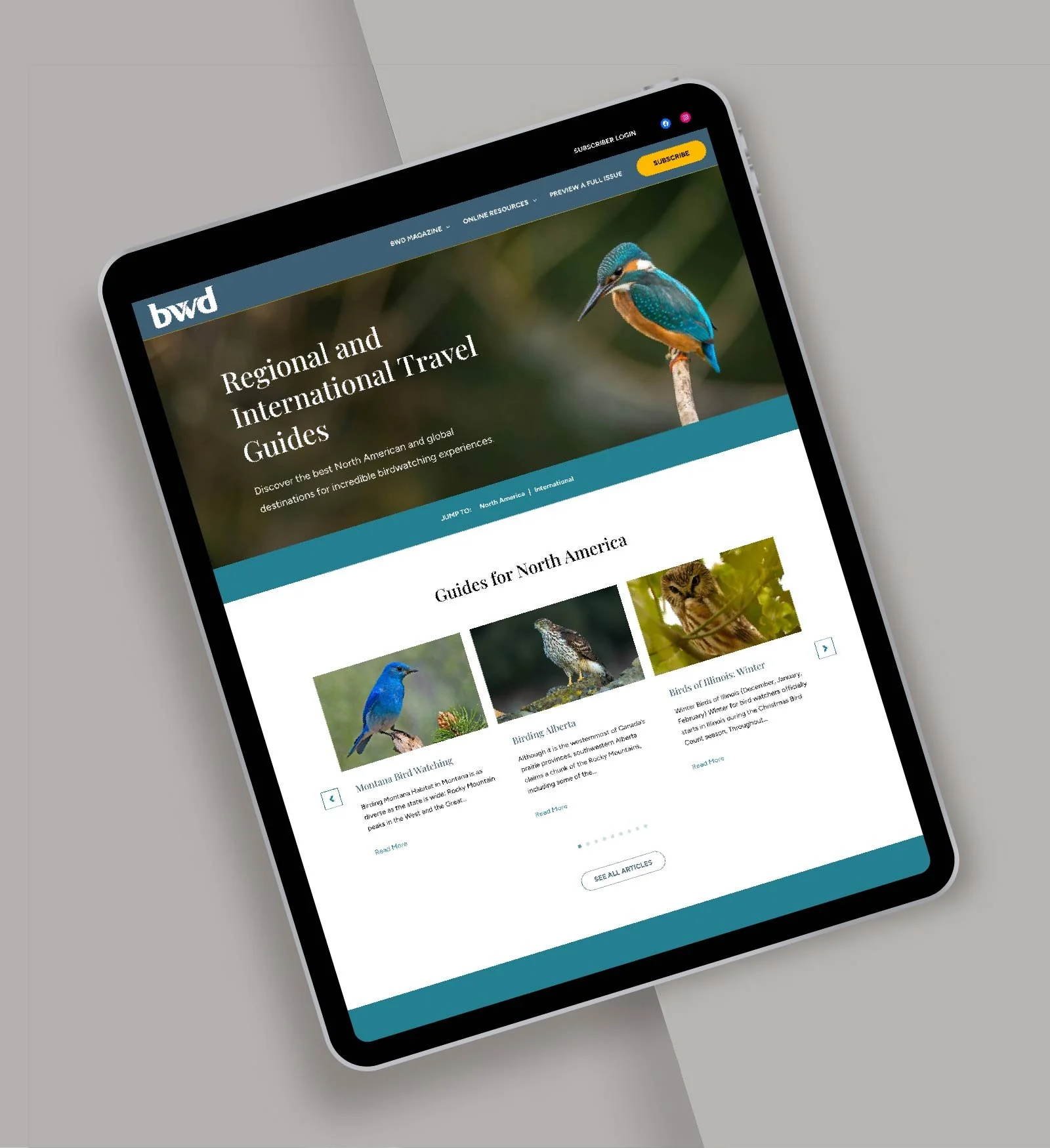
Refocused homepage around a clear editorial story: bold hero with one standout subscription CTA, followed by curated features and organized birding resources.
Introduced a modern, magazine‑like visual system: more white space, refined typography, and structured grids so images and headlines lead.
Clarified navigation and footer so readers can quickly find issues, articles, resources, and subscription info.
Elevated cards and content groupings to differentiate must‑read stories from general posts.Results
Results
A cleaner, more editorial site that finally looks and behaves like a modern birding magazine. Readers discover content faster, understand the value of subscribing, and follow a simpler, more persuasive path to becoming BWD Magazine subscribers.
Before and After
About
Bird Watcher’s Digest’s legacy site was dated and cluttered with competing CTAs and hard-to-scan content that obscured the subscription value. I refocused the homepage on a single bold subscription CTA and introduced a magazine-like visual system with more white space, refined typography, and structured grids. I clarified navigation/footer for easy access to issues and resources, and elevated cards to highlight must-read stories. The result is a cleaner, more editorial site where readers find content faster, see the subscription value, and follow a simpler, more persuasive path to subscribe.